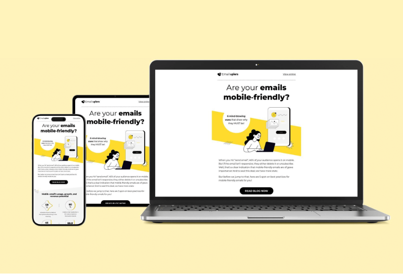
Responsive email template design
isn’t just a trend—it’s the new standard. With 71.5% of people checking their
emails on mobile phones, making sure your emails are mobile-friendly is
non-negotiable.
We all know the drill: your emails must look good and function
well on a mobile screen.
But here’s the thing—responsive email design is more than just
fitting your content to a mobile screen. Don’t forget that 28.5% of users check
their emails on different devices. Your engagement will drop if they can’t read
or interact with your emails easily.
Not to forget, you can improve your email deliverability with responsive designs by
preventing your messages from getting flagged as spam due to design issues.
The bottom line?
If you want people to engage with your emails, you must think
beyond mobile and ensure your designs work on any device.
As Megan Boshuyzen, Sr. Email Developer at Sinch Mailjet, says,
“Think about your email templates from start to finish. How should they look on
the smallest and largest screens? Instead of stacking your desktop layout on
mobile, consider how your design could unstack or expand on larger screens.”
Wondering how to design responsive emails for your next email
campaigns? Keep reading to find out about responsive email designs, their best
practices, and their challenges.
What Is Responsive Email Template
Design?
Reading an email on a desktop is a relatively straightforward
experience. With ample screen space and precise mouse control, navigating
content is effortless.
But, the landscape changes dramatically on smaller screens.
Smaller devices, with their compact displays and touch-based interactions,
demand a different approach. Images shrink, text becomes condensed, and
scrolling becomes more frequent.
Responsive email design is the solution to this challenge.
A responsive email design automatically adjusts to look great on any screen
size—whether it’s a desktop, mobile phone, tablet, or smartwatch.
Responsive email templates ensure that all your content—images,
text, videos—has no rendering issues, irrespective of the device.
You send a single email design to all your subscribers without
worrying about which device they’ll use to view it. This means everyone sees a
stunning, eye-catching header right from the start, creating a strong first
impression.
Because responsive emails look great on any device, subscribers
can easily reopen them on their laptop or desktop when they’re ready to
purchase. With CTAs perfectly sized for easy tapping and no need for extra
browser tabs, the experience becomes smooth and enjoyable—no more pinching or
resizing, just a simple scroll down to engage with your content.
Below is a perfect example of how a responsive email adapts to
both desktop and mobile screens-
Desktop View
In the desktop view, the image is on the right, and the text is on the left.
Everything is spaced out nicely because there’s plenty of room on the screen.
Mobile View
But when you open the same email on your phone, the screen is much smaller. A
responsive email design adjusts to this by stacking the content vertically. So,
instead of the image being next to the text, it appears below it.
This way, email content fits perfectly on your phone screen, and
you don’t have to scroll sideways or zoom in to see the details. The text is
centered, making it easier to read. The CTA button is big enough to tap with
your thumb.
This idea sounds great, but to make your responsive emails truly
effective, be sure to follow best practices.
Responsive Email Design Best Practices
1.
Use A
Single-column Layout
One
of the biggest pitfalls you want to avoid in email design is using a
multi-column layout.
Multi-column
email layouts are great. But since most mobile devices have vertical screens,
they shrink emails with multiple columns to fit, which can mess up your design.
To
avoid this, stick with a single-column layout. That way, you ensure your
responsive email template looks great on any screen size.
2.
Limit
Text Length
Don’t
cram your emails with a ton of text. Too much content can turn into a narrow
wall of text that’s hard to read.
Break
up your email content into bite-sized chunks using short paragraphs. This and
the plenty of white space make your email easier to read and digest on smaller
screens. This way, readers can easily scan your email without endless scrolling.
3.
Adjust
Font Size
When
designing responsive emails, ensure your font size is easily read on any
device. Use larger fonts so your subscribers don’t need to pinch or zoom. Aim
for around 14 px for regular text and 22 px for headlines. Use just one or two
fonts to maintain a cohesive look.
4.
Avoid
Image-only Email Designs
Avoid
using image-only designs in your emails. They’re risky because they can end up
in spam folders, and if the images don’t load, your message won’t get through.
Aim
for a text-to-image ratio of 60:40 for better results. This ensures your emails
are engaging and accessible, even if images don’t display properly.
5.
Optimize
Image Size
Always
optimize your images to ensure they look great on any device. Double-check how
they display on mobile—images often stretch to fill the screen, and poor
resolution can ruin your hero shot.
Avoid
using oversized images that take forever to load or too-small images that end
up pixelated. Instead, use images that are perfectly sized for your email.
Edit
them to fit your template before uploading, or use an email editor to adjust
them directly.
6.
Add Alt
Text
Always add ALT text to your images.
This text appears if the image doesn’t load or if someone is using a screen
reader. Plus, emails with alt text look more legitimate to email providers.
It’s a simple step that enhances both accessibility and deliverability.
7.
Have
Easy-To-Click CTAs
Clear
and easy-to-spot calls to action (CTAs) are essential. Use bright, contrasting
colors that pop against your email design. Don’t hide them in tiny text or
images – big, clickable buttons are the way to go.
Remember,
people have different-sized fingers, so make sure your buttons are big enough
to hit without accidentally tapping the wrong thing. Keep them spaced out, too,
so there’s no confusion.
Aim
for button dimensions of approximately 44 x 44 pixels (minimum 29 x 44 pixels)
for optimal clickability.
8.
Avoid Too
Many Hyperlinks
Less
is more when it comes to hyperlinks in your responsive email templates. Don’t
clutter your responsive email with a million links.
This
can make it hard for users to navigate on smaller devices without accidentally
tapping the wrong link.
Instead,
keep it simple with a clear, prominent CTA button. This ensures your message is
focused and easy to interact with, leading to a better user experience.
9.
Most
Important Information At The Top
With
so many emails flooding inboxes daily, it’s crucial to grab attention quickly.
So, always place the most important information at the top.
Design
responsive emails with a clear hierarchy so readers can quickly grasp your main
message, even if they don’t scroll down. This ensures your key points are seen
first and make a stronger impact.
10.
Test
Always
test your responsive email templates on different devices and email clients to
ensure they look great everywhere. Testing helps you catch and fix any issues
before hitting send.
If
your email looks good and is easy to navigate, try experimenting with different
designs to see how your subscribers respond. This way, you can find the optimal
layout that best suits your audience’s preferences.
Now that you’ve learned the rules for designing responsive
emails, let’s examine their effectiveness and impact on ROI.
How Responsive Email Design Templates
Impact ROI?
Wondering how responsive email design can impact your bottom
line? Let’s break it down.
·
Better
User Experience
Your
readers are busy, often checking emails on the go. A responsive email template
design ensures that they don’t have to pinch, zoom, or scroll sideways just to
read your message.
With
clear, easy-to-tap buttons, they know exactly where to click, making it a
breeze to take action. The easier you make it for them, the more likely they
are to engage—whether they’re on their phone now or their laptop later.
·
More
Conversions
If
your emails and landing pages look great on any device, you’ve already won half
the battle. No more worrying about lost sales because of awkward layouts or
slow-loading images.
When
your email design aligns with how your subscribers shop, you’re set up to
convert—whether they’re in line at a coffee shop or relaxing on the couch.
·
More
Sales
A
responsive email that catches your readers’ attention on mobile will keep them
interested when they switch to a bigger screen.
Maybe
they’re more comfortable making purchases on a desktop—that’s fine! Your email
will still look sharp, helping you seal the deal. First impressions matter; a
strong one leads to bigger sales when they’re ready to buy.
·
Fewer
Unsubscribes
If
your email doesn’t display well, it will likely get deleted quickly. With 22%
of emails getting unsubscribed if they don’t work on mobile, responsive design
is your safety net.
By
delivering a seamless experience, you’ll keep your subscribers happy and reduce
the chances of them hitting the unsubscribe button or filing a complaint.
What Are the Challenges With
Responsive Email Design?
Responsive email design sounds like a game-changer—and it is.
But let’s be real; it’s not without its hurdles. If you’re not facing any
challenges, you might actually be missing something. Here are some of the key
roadblocks you’re likely to encounter while designing responsive email
templates:
1.
Cross-Device
Compatibility
Getting
your email to look perfect on every device is no small feat. What works
flawlessly on a smartphone might fall apart on a tablet or desktop. Testing
across all devices is essential, but even then, you might find that certain
elements just don’t play well together.
2.
Content
Density
Trying
to squeeze all your brilliant copy onto a tiny screen without turning it into a
giant block of text is like fitting a camel through the eye of a needle.
You’ll
want to keep your email copy concise. But even then, there’s only so much space
to work with. Balancing a clean, readable layout with the need to include all
your important information can feel tricky.
And
let’s not even get started on trying to fit in all those links and CTAs,
especially if you’re featuring multiple products.
3.
Icon and
Image Adaptability
Images
and icons need to look sharp, no matter the screen size. The challenge?
Ensuring they don’t become blurry or distorted on devices with different pixel
densities. This is where using retina images comes in handy, but even then,
you’ll need to check how everything looks on different screens carefully.
4.
Testing
and Debugging
Lastly,
testing is a beast. You must check your email on every device, in every email
client. You’ve got to check how everything—from CTAs to images—behaves on
various devices. And this takes time—lots of it.
Conclusion
The responsive email template design does not involve walking in
the park, but the rewards are worth the effort. We hope we’ve cleared up any
doubts you might have had about designing responsive emails.
If you follow the advice and best practices outlined in this
post, your valuable emails will look their best and make a strong impact. Stay
patient, keep testing, and refine your approach as needed.


